Pages

Wednesday, August 31, 2011

Getting a Bit Shabby....

Hey there!  Happy Wednesday!!  Got a card today for three challenges:  the Paper Players (sketch), Flourishes (Bingo) and Stampin' Sisters in Christ (recipe).   I hadn't planned on putting this into three challenges, but when I saw that that SSIC challenge was a recipe and I already had two of the requirements I decided to add the third so it would work for that challenge, as well. 


The Flourishes challenge is a "bingo" challenge, ie pick three items in a row.  I went with the middle row of embossing, pink and pearls.  I recently got some new SU! designer papers and paper embellishments from the Beau Cheateau line.   Love the soft pink, blue, brown and cream colors in this line of dp.  Absolutely perfect for a shabby chic look.  I embossed the patterned paper which created a bit of a problem for me because when I was trying to apply the adhesive the first piece ripped horribly... as in unable to save it!!  So, embossed another piece and tried to be a bit more careful when I applied the adhesive.   The butterfly image is from the SU! set Strength & Hope.  A percentage of the proceeds from the sale of the set will be donated to the Breast Cancer Research Foundation... a very worthy cause.  The SSIC challenge asked us to use three of the following:  ribbon, button, brad, swirl, hat pin, charm or popped up image.   I went with a brad, the ribbon and popped up the image. 

Supplies:  Cardstock:  PTI cream; SU! Crumb Cake; PP:  SU! Beau Chateau dp; Beau Chateau Side Note;  Ink:  SU! Pink Pirouette; Impress Fawn; Pearls, SU! brad; May Arts silk ribbon; SU! scalloped circle punch

Tuesday, August 30, 2011

Be Faithful....

Hey there!!  Hope your week is going well.  Can't believe that August is almost over, that my big kid goes back to school on Thursday and that he is now a 7th grader!!!  Yikes!!! Where did the time go???


Anywhoo... have a card for a couple of challenges:  ODBDSLC74 to use a doily on your project and  CR84FN37 to use turquoise, light blue and a neutral.   For my neutral I went with white.   The layout comes from the current Sketchbook Saturday sketch.   For my card I used the ODBD set "Faith".  I just love the large butterfly branch image that is in the set.  I thought it would work perfectly for the central panel of the sketch.   I also used the Brocade background stamp from ODBD to create the background.   Did a bit of distressing with my distressing tool on the patterned paper and the main panel.  The card was finished off with some butterflies punched from the patterned paper with my Martha Stewart butterfly punch.   I really like the crisp, clean look of the card.

Supplies:  Cardstock:  PTI white; SU! Tempting Turquoise; Tempting Turq. pp; Ink:  Tempting Turq., Memento Summer Sky; Stamps:  ODBD Faith & Brocade Background; MS butterfly punch; pearls; Wilton paper doily

Saturday, August 27, 2011

Many Thanks....

Hey everyone!!  Happy Saturday!!  Time, again, for another fabby challenge from Less is More.  This week Chrissie and Mandi are challenging us to take 3 different LIM challenges and put them into one card.   While this might sound a bit, well, challenging, in fact I found this one quite easy.  For my three challenges I chose the following:  Week #1:  pink, black & white; Week #13:  congrats or thank you and Week #25:  buttons or ribbon.  


I decided to use the challenge from Week #1 because that is the ONLY LIM challenge I did not get to participate in.  I found the challenge on the last day of the challenge and didn't have time to make something (insert frowny face).   I chose the other two because who doesn't need thank you or congrats cards and quite frankly I just LOVE ribbon!   I also going to be putting this card into this week's CAS-ual Fridays challenge to use stickers or rubons.   The sentiment is a sticker from SRM.   To be honest I have never much cared for stickers.  I always ended up getting them in the wrong spot or they just didn't really go with what I was making.  But... that has all changed now that I have tried SRM stickers.  They are fantastic and so easy to use!  If you haven't tried them, you really should!

Supplies:  Cardstock:  PTI white; SU! pink; Gina K. black; Stamp:  Hero Arts Rose Background; Sticker:  SRM - Fancy Sticker Sentiments - Thanks; Ink:  SU! Pretty in Pink; Pearls Hero Arts; Ribbon:  PTI

Friday, August 26, 2011

CASEing Myself...

Hey there!! Wow... what a gorgeous day we are having here in Washington state!  Just spent the majority of it at a local beach with my sister and her three girls.  My little one had a blast playing with his cousins and getting all covered with sand!


Got a card today for the current CASE Study challenge, as well as for ColourQ.   This week at CASE Study Chupa is asking us to make a card in our "signature style".   Now I don't know if I have a "signature style" because sometimes I feel like my style is all over the place!  But I do know that I love the Clean and Simple (CAS) style and probably make more cards in that style than any other.  I also know that when I'm confronted with a color combo that I find kind of tricky (like this week's ColourQ combo) I tend to keep things very simple.  So, for my card I CASEd a card I made a month or so ago that really exemplifies my CAS style (you can see the card here).   I used one of my favorite SU! sets, Echoes of Kindness, and a sentiment from a My Favorite Things sentiment set.  The sentiment is one of my favorites and can actually be found in my blog banner:  We do not remember days, we remember moments.   I stamped the floral image using Palette Sunflower ink (it closely matches SU!'s Crushed Curry) and then overstamped the sentiment using Old Olive.  The card base is SU!'s Island Indigo.  The pumpkin colored gems are from Hero Arts. 

And so... there you have it!  My clean and simple card.

Supplies:  Cardstock:  PTI white, SU! Island Indigo; Stamps:  Stampin Up! & My Favorite Things; Ink:  Palette and Stampin Up!; Gems:  Hero Arts

Thursday, August 25, 2011

Blue Mood....

For my Flourishes Birthday Hop card click here.

Hey there!!  Here with a card for the current ODBDSLC challenge (a sketch) and the current Flourishes Timeless Tuesday challenge (to make your sentitment the focus).   I recently saw a beautiful card by ODBDSLC design team member, Lori, that was done in blue and white.   I just loved the look and had been wanting to make a card using those two colors.  Today was my opportunity.  I must be honest, though, and tell you that when I actually started making this card last night I was certain it wasn't going to turn out very well.  Thank goodness for the light of a new day and the addition of some lace!! 


Since this card is for the ODBD and Flourishes challenge I used stamps from both companies.  The scripture is from the ODBD Scripture Col. 7 set and the butterfly from the Flourishes Clematis & Butterflies set.   The white cardstock is PTI and the navy is Stampin Up!'s Night of Navy.

Supplies:  Cardstock:  PTI white, SU! Night of Navy; PP:  Night of Navy; Stamps:  ODBD & Flourishes; Gems:  unknown; Ribbon:  SU! Night of Navy & May Arts White Lace; Sizzix embossing folder; Ink:  SU! Night of Navy

Tuesday, August 23, 2011

Happy Birthday Flourishes!!!


Flourishes is lighting the candles and getting ready to sing to honor their fourth birthday!!!  And, as a way to celebrate, I'm happy to say I was handpicked to help them have a bit of a party as a designer for their customer appreciation hop!  The only challenge here was to create a card or project using my favorite Flourishes stamp set.  Read on and I'll tell you how you can win some Flourishes goodies, too!!


It was hard for me to pick my favorite Flourishes set to use (because pretty much all of them are favorites!!), but I decided to use one of the very first Flourishes sets I purchased, Sweet Peas.  I wanted the Sweet Peas set from the moment I saw it and it continues to be a favorite of mine to this day.  The sentiment is from the Flourishes set Sweet Violets.  For my card I used some new Authentique papers from the 6x6 bundle "Uncommon".  I stamped the image and colored it with my Copics.  I then die cut the image using two Spellbinders dies (a plain circle and one of the Floral Doily dies).  The two dies were then layered as you see.  The card layout is courtesy of PageMaps and a challenge they currently have going on where you can win five Flourishes stamp sets, as well as five 6x6 Basic Grey paper pads.

So... want to know what you can win from Flourishes... well just take a look at this fantastic blog candy treat:


If you would like to learn more about how you can win all of these stamp sets, just click HERE to read up on today's hop and challenge.   Just a little hint... there are three ways to win!!!

If you arrived here by way of the super talented Benzi's blog, then you are on the right path.  If I'm your first stop, you will wnat to go back to the Flourishes blog to start this hop from the very beginning.  You will have until September 1st at 5 pm CST to enter!  Next up on the hop... Tera!

Thanks for stopping by... I hope that you take part in the challenge for the chance to win such an awesome prize!!

Supplies:  Cardstock:  PTI white, soft stone; PP:  Authentique; Stamps:  Flourishes; Ink:  Memento Tuxedo Black, PTI True Black; Copic Markers (YG00, YG03, R81 & R83); Spellbinders dies; Zva Creative pearl flourish; Fiskars punch

Saturday, August 20, 2011

Clematis & Butterfly

Hey there!  Here with a card for this week's CASE Study challenge and Flourishes Timeless Tuesday challenge.   This week the Timeless Tuesday challenge required us to use pink, ribbon, lace and a button and over at CASE Study the challenge was to CASE a card that CASE Study founder, Chupa, had made.  To make things really easy on myself I decided to CASE Chupa's card that she made for this week's Timeless Tuesday challenge. 


I kept the layout she used, but changed the image, left off a sentiment and added three buttons instead of just one.  The Flourishes set I used is the Clematis & Butterflies set.  The image was stamped using Memento Tuxedo Black and then colored with the following Copics:  YG00, YG03, YG06, Y21, RV000, RV02, RV04, BG000, BG01 & BG05.  The image was stamped a second time and only the butterfly and one of the flowers was colored and then trimmed out.  I diecut the image using the PTI notebook die and adhered the butterfly and flower.  Finished the card off with the bit of lace, a pink bow and the three buttons.

Supplies:  Cardstock:  PTI white; PP:  BG Green at Heart; Stamps:  Flourishes; Copic Markers; Memento ink; May Arts pink crinkle ribbon & white crocheted lace; PTI die

Some things....

Hi there!! Saturday is finally here and time for a new Less is More challenge!  This week Chrissie and Mandi are challenging us to make a card that has something that moves on it.  That could mean something on your card actually moves (a spinner, pop up, etc) or the image of something that moves.   I'm not exactly sure where my card falls... probably somewhere inbetween... because the only stamping on my card is the sentiment.  The butterfly... the thing that moves... is a diecut that I attached with a rolled up glue dot so the wings actually do move. 


This card all came about because yesterday I got my club order from my SU! dealer... err... umm... demo, Jenna.  One of the things in my order was the new embossing folder Flower Garden.  When I pulled it out of the package I was a bit surprised that the image is upside down, but Jenna assures me that it is supposed to be that way. Okay... on to the card!   Many of you know that I like kraft cardstock almost as much as white cardstock so for this card I did kraft on kraft with the pop of yellow in the butterfly.   This card also works for this week's CAS-ual Friday challenge to use embossing (heat or dry) so I will be popping it into that challenge as well.

Thanks for taking a peek...

Supplies:  Cardstock:  SU! Crumb Cake; PTI Lemon Tart; Ink:  PTI True Black; Stamps:  SU! Just Believe; SU! Beautiful Wings Embosslit; SU! Flower Garden EF; Hero Arts gems

Thursday, August 18, 2011

When I'm Down...

Hi there!! It's been a beautiful week here in Washington with sunshine every day!!  I think this is our first long stretch of sunshine all summer! 


Have a card that I made for the current color challenge over at JayGee's Nook to use the color purple.  I have been eyeing the monthly challenges there for awhile and finally got a chance this month to play along.    For this card I used some Stampin! Up Concord Crush patterned paper and cardstock and Ranger's Dusty Concord distress ink.  The pinwheel was created using the pinwheel die from My Favorite Things.  The sentiment is from the stamp set that comes with the die.   I have to admit that in my photo the color looks more blue then purple, but I promise you the color is purple.   The background was created using the Hero Arts design block Envelope Pattern.

Thanks for taking a peek...

Supplies:  Cardstock:  PTI white, SU! Concord Crush; PP:  SU!; Ink:  Ranger Dusty Concord; Stamps:  Hero Arts & My Favorite Things; SU! punch; purple gems; My Favorite Things pinwheel die

Wednesday, August 17, 2011

Mini Journal...

Hey there!  Here today with a little project that works for five different challenges!  That is a first for me working in five challenges on one project.  The most I have done prior to this is four and I thought that was alot of challenges!  But I know there are crafters out there who routinely enter their projects in way more then five challenges!    Anywhoo... my little project works for the following challenges:


JUGs  - embellish a notebook or journal
City Crafters - use up your scraps
Shabby Tea Room - polka dots
Stampin Sisters in Christ - use music in some form
Card Patterns - sketch


When I saw that the JUGs challenge was to embellish a notebook or journal I knew right away that I wanted to do a mini one.  My little journal is 4 1/2 x 3 1/4.    The perfect size for the Card Patterns sketch.  My last project had some scraps left over and so I used them along with some other scraps to put together my journal and lucky for me those scraps included the polka dotted paper and the music paper!  Now I have to say that had it not been for fellow crafter, Michelle, posting her projects for City Crafts and the Shabby Tea Room I wouldn't have known my little journal would fit right into those challenges... so, thanks, Michelle! 

I love how my little journal turned out so I think I'm going to be keeping it for myself.   Thanks for taking a peek...

Supplies:  Cardstock:  PTI Vintage Cream; PP:  October Afternoon Thirft Shop; BasicGrey Green at Heart; LilyBeeDesign Picket Fence; Glue stick; mini journal; Sizzix leafy branch die; KaiserCraft rhinestones; Prima Trellis Rose

Tuesday, August 16, 2011

This Is The Day.....

Hi There!  Hope everyone's week is going well.  For me... so far so good.  Got my oldest off to camp yesterday so my little one gets mommy and daddy all to himself!   I think he is pretty happy about that!


A card for a couple of challenges.  ODBD's Shining the Light challenge and the Paper Players.  The challenge this week at PP is to use the following colors:  Pretty in Pink, Regal Rose and Rose Red.   When I saw the combo my heart kinda sank because I tend to be far to literal when it comes to colors, meaning I MUST USE THE EXACT COLORS!   So... I have been trying to work on that and be a bit more flexible.  To that end I rummaged through my extensive collection of 6x6 paper pads and came up with two patterned papers that were good matches.  Thankfully my literal half was appeased by the fact that I do have Pretty in Pink ink and cardstock and Regal Rose ribbon, otherwise I don't think I could have gotten the card made!  The ODBDSLC challenge is to use a tag on your card.  That part was easy peasy because I have several ODBD tag sets and the matching die.  For the card I used the tag from the Tulip Tag set and the verse (one of my favorites) from the Daffodil Tag set.   The layout is based on Chupa's current Sketchbook Saturday sketch, although I did move the bow and the placment of the roses. 

Thanks for taking a peek...  and I just want to say a thank you to those of you who have recently started following my blog.  I really appreciate it!

Supplies:  Cardstock PTI white; SU! Pink Pirouette; Patterned Paper:  LilyBeeDesign Picket Fence & BasicGrey Green at Heart; Stamps:  ODBD; Ink:  SU! Pink Pirouette, Palette L'Amour Red; Ribbon:  SU! Regal Rose; Dies:  ODBD tag die; Spellbinders Large Scallop Circle die

Monday, August 15, 2011

You Had Me At Kraft....

Hey there!!  As the title of my post may suggest to you I have a card I made using kraft cardstock.  I think I love making cards with kraft cardstock almost as much as I love making cards with white cardstock.  So when I saw the new color combo from CR84FN of yellow, kraft and a neutral I was totally in!  I love kraft with just about every color, but for some reason I particularly like it paired with yellow and cream.   I combined the CR84FN combo with the new sketch from Waltzingmouse.


Late last week I got some new Waltzingmouse stamps (yay!!), You're Lovely and Cicely at Halloween and just had to use the You're Lovely set for the card.  I stamped the dress image on PTI's Bitty Dot Basics kraft paper and then trimmed out the dress portion.  I stamped the rosette on some PTI Lemon Tart Bitty Box Basics and trimmed it out, as well.  The dress image was stamped again on cream cardstock and then the dress and rosette adhered to that image.  I stamped the sentiment using Stampin Up!'s Crumb Cake (kraft) ink and trimmed it out.  The kraft colored seam binding is from Stampin Up! and I used it to create a double bow to which I adhered a little cream Prima rose.  

Thanks for taking a peek...

Saturday, August 13, 2011

Getting Inky with Less is More....

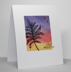
Hey there!!  Saturday has rolled around, again, and that means a brand new challenge over at Less is More.  This week Chrissie and Mandi have challenged us to get a little inky and use either use our inks in a way we have never tried before or to use a favorite technique.  Oh and add to that the fact that the card needs to be one layer!! Yikes!!!  I opted to use a favorite technique... emboss/resist.  Usually when I do emboss/resist I clear emboss the image and then apply the distress inks, but for this card I decided to emboss the image using black embossing powder and then apply the ink.  This card is a stripped down version of a card I did earlier in the week using the same technique.  You can see that card here.  Once, again, I used the Flourishes Ferns & Fiddles set. 


I decided to do a bit of masking using a Spellbinders die.  I cut a piece of cardstock the same size as my card front and then using the Spellbinders die cut out the rectangle.  This piece was taped to the card and the image was stamped using the watermark ink.  I removed the mask, applied the embossing powder and heat set it.  The mask was then reattached and the inks applied.  Finished off the card with a few gems and the sentiment.

Thanks for taking a peek.... now go get inky!!

Supplies:  Cardstock:  PTI white; Inks:  Ranger Scattered Straw, Aged Mahogany & Dusty Concord, VersaMark Watermark ink; PTI True Black;  Stamps:  Flourishes Ferns & Fiddles; Gems:  Hero Arts; Die:  Spellbinders rectangle die; Embossing Powder:  Filigree Black

Friday, August 12, 2011

ColourQ 97...

Hey there... after spending the last day or so coloring up a storm with my Copic markers I decided to make something that required absolutely no coloring.  Made this little card using the current color combo from ColourQ.  Hadn't done a ColourQ challenge in ages because of one thing or another (lack of time, lack of talent, etc..) so was determined to make something using this week's colors.  The color choices are bold and bright with a bit of softness thrown in for good measure. 


On Wednesday my most recent PTI purchases finally showed up on my doorstep (yay!) and one of those purchases was the newly release set Half & Half.  Thought it would be fun to use that set for my card.  I die cut the strip of Tangerine Tango polka dot paper with one of the dies that match the set and then cut a piece of white cardstock to fit inside.  I stamped one of the little flourish bits included in the set on the bottom using Melon Mambo ink and the sentiment using black.  A piece of Melon Mambo cardstock was run through my Big Shot inside the SU! Elegant Lines embossing folder.  After putting everything together I finished off the card with a few black rhinestones and some Spring Rain buttons. 

Thanks for taking a peek....

Thursday, August 11, 2011

Flourishes x 3....

Hi Ya!  This week is release week at Flourishes and that means sneak peaks of the beautiful new sets (and Flourishes ALWAYS releases the most beautiful sets!!) and fun challenges.  Today I have three cards made for three different Flourishes challenges.  First up is my card for their Shades of Sunset challenge


For this card I got out my Ferns & Fiddles set and used the emboss/resist technique.  I stamped the fern image on cream cardstock using VersaMark watermark ink, applied black embossing powder and heat set.  Three distress inks (Scattered Straw, Aged Mahogany and Dusty Concord) were applied, the piece was matted with kraft cardstock and adhered to a dark purple card base.  The sentiment from the set was stamped on cream cardstock using black ink and then inked with Scattered Straw.


The second card is for the Flourishes Timeless Tuesday challenge to get fruity.  For this card I used the set Peaches & Cherries.  I cut the scalloped edge using a PTI die and then stamped the small peaches and cherries images from the set in each scallop.  The images were colored with Copic markers (R24, R27, Y35, Y38, YG63 and YG67).  The sentiment was stamped on a small die cut tag and attached to the ribbon using a small pin.  A pretty simple card, but I really love how it turned out.


The third card is for their scavenger hunt challenge.  You had to hop to eight different blogs and pick up each element that you need to have on your card.  The elements are the colors pink, green and white, patterned paper, bling, ribbon and something square.   This time I used a Flourishes set Humming Along.  I colored the image with the following Copic markers:  RV23, RV21, RV25, YG00 & YG03 and then die cut it using a Spellbinders rectangle die.  The patterned papers are from LilyBee Design and Cosmo Cricket.  I die cut the gingham paper using the largest die in the Spellbinders Rectangle Fleur De Lis die set.  The sentiment was diecut using a small square Spellbinders die.   Finished the card off with the green bling and a green silk bow.

Whew!! That was a long post!  Thanks for taking a peek....

Monday, August 8, 2011

The Places You Will Go....

Hi Ya!! Hope everyone's week got off to a good start.  Have a card today for the new Paper Players challenge to make a school themed card.  When I saw the challenge I was kinda like "well... hmmm... what school themed stamps do I own?" and the answer is... not that many!  I have a Kim Hughes set that she designed when she worked for the now out of business Cornish Heritage Farms called "Making the Grade".  The other school themed set I have is the Taylored Expressions set "The Places You Will Go".   And the winner... "The Places You Will Go"!    The layout of the card comes from TESC143.  Because I really needed to use the Dr. Seuss quote "The more that you read, the more things you will know.  The more that you learn, the more places you will go" with the hot air balloon image I decided to make the card an easel card.


The papers I used are from the Lilybee Designs Picket Fence 6x6 pad and the Cosmo Cricket Odds & Ends 6x6 pad.  In retrospect I think I would have used cream colored cardstock for the card, but I had the white cardstock close at hand and so I went with that.  Overall, though, I really like how the card turned out.


Speaking of places you can go today the hubster and I took our two boys to Mt. Rainier National Park for the day.  We headed to the Sunrise area of the park.  I love Sunrise because it is easier to get to than the other more popular Mr. Rainier destination of Paradise, it is less crowded and the views of the mountain are simply outstanding.  I love living in Washington and having Mt. Rainier in my backyard.  Here are a couple of pictures I took... one of the boys standing on some snow left over from this last winter and the other of the mountain.  We got so much snow this last winter in the Cascade Mountains that people were able to ski until June and the road to Sunrise was closed until late June.


Thanks for taking a peek....

Sunday, August 7, 2011

Sweet Peas

Hi Ya!  Here with a card for a few challenges.   The current Flourishes Timeless Tuesday is favorite flowers and one of my favorite Flourishes set is the Sweet Peas so I decided to use that set for the challenge.  I'm also putting this into the Flourishes Bringing Back Beautiful challenge to make a CAS card.  Finally I used the new color challenge from Embellish of yellow, pink, green and kraft.  There is a second part to the Embellish challenge and that is to color your image and so I colored the Sweet Peas with Copic markers (R81, R83, YG03 & YG23)


I stamped the image, colored it and then die cut it using a Spellbinders large rectangle die (2nd largest in the set).  The green cardstock was die cut using the largest die from the small rectangles set.   The corner pieces were die cut using dies from the Spellbinders Fleur De Lis Accents set and then inked with white pigment ink.  I added the bit of bling, but not sure I really like it.  The patterned paper is from the DCWV mat stack Lemon Flower.  

Thanks for taking a peek....

Supplies:   Cardstock:  PTI kraft & white; PP:  DCWV Lemon Flower; Copic makers; Spellbinders dies; Flourishes - Sweet Pea; rhinestones (unknown)

Saturday, August 6, 2011

Red, White, Blue & a Thank You!!

Hi Ya!  Saturday morning and time for a new Less is More challenge, but first I must take care of a few thank yous.  The first Thank You goes to Chrissie and Mandi, the creators of the Less is More challenge, for picking me as their challenge winner for the month of July!!  What an honor!!!  Thanks so much ladies... your challenges are brilliant and I can't image what my Saturdays would be without a little Less is More!!  And now a very big thank you to all my fellow LIMettes (and you know who you are!!) for all the lovely comments you leave me week after week!  Ladies you all totally ROCK!!


Now... on to my card.  This week Chrissie and Mandi have challenged us to use the colors from our country's flag and since I live in the USA that means the "Star Spangled Banner".   When I thought about what I would do I knew I had no choice but to make a card using stars.  And so here is my little card for today.  The star is from the Hero Arts set, Galaxy of Stars and the sentiment is from Waltzingmouse.  Since the star is full of the word star I decided to make a it a "congrats" card.  I think it would be a good graduation card.   I also including a photo of the flag as requested by Chrissie and Mandi.

Thanks for taking a peek....

Supplies:  Cardstock:  PTI white & SU! Night of Navy; PTI Bitty Star Basics Pure Poppy; Stamps:  Hero Arts & WMS; Ink:  SU! Night of Navy & Riding Hood Red

Monday, August 1, 2011

Belated Birthday Wishes....

Hi Ya!  Today was another absolutely gorgeous day here in Washington!  And so on this beautiful day we headed up to Seattle and the Boeing Museum of Flight.  Our little guy was in HEAVEN because he LOVES cars, trains and airplanes.   The Museum of Flight is a really cool place for big people, too.  They have the only flyable B17 "Flying Fortress" bomber, a Concorde and Air Force One (used by five presidents including Kennedy and Nixon!).  So, after all that I wasn't sure I would be getting anything done today, but I did get a quick little card done for three challenges:  CR84FNthe Paper Players and the SCS CAS challenge.


The color combo over at CR84FN is probably one of my favorites so far:  lavendar, grey & celery green.  I could have made a far more elaborate card using the Paper Players sketch, but I decided to keep the card really simple because I also posted the cards on Splitcoaststampers for this week's CAS challenge to make a belated birthday card.  When I started to make the card I was going to use one of my "go to" sets SU!'s Fast & Fabulous, but then decided that I really needed to try out the PTI anniversary set Botanical Silhouettes so I used that set along with a sentiment from the Waltzingmouse set Fancy Phrases.  As I started putting the card together I realized that turrning the sketch on its side was going to work best for me.  I really love how the card turned out. 

Thanks for taking a peek...

Supplies:  Cardstock:  SU! Basic Grey & Certain Celery; PTI white; Stamps:  PTI & Waltzingmouse; Ink:  Ranger Milled Lavendar Distress Ink, SU! Certain Celery, Ancient Page grey; SU! border punch; PTI Lavendar Moon ribbon