Hello, hello!! Wanted to let you know that I have a card up over at the Precious Remembrance Shop blog today. Here is a little peek... I hope you will check it out!

Thanks for stopping by...
 Hello, hello!! Wednesday is here and that means time for a brand new Colour Me...! challenge and since April has 5 Wednesdays that also means that it is your chance to use up to five colors of YOUR choice!! How fun is that??? Unfortunately, the end of the month also means that this is the last Wednesday for our sweet and super talented guest designer, Anita. She has done an amazing job this month and I, for one, have enjoyed having her design with us! All the details regarding the challenge can be found on the Colour Me...! blog.

 I decided to go with only three colors and used the Viva la Verve week #3 layout, as well as the VLV inspiration photo. I pulled my three colors from that photo: navy, turquoise and bright green. All the stamps are from Verve (Holiday Treats). The dies are from Verve (Tagged Rectangle die & Cup of Cheer dies; Reverse Confetti and PTI). I embossed the background using the PTI chevron cover plate. The tag was die cut and stamped with the image from Holiday Treats. Some twine in turquoise and green was adhered to the white cardstock piece before the tag was added. The banner was die cut, stamped with the sentiment and layered on the tag. Finished with the little die cut coffee cups that I stamped in turquoise and green. I'm also going to pop this into this week's Simon Says Stamp Wednesday challenge: Anything Goes.
 This one started out as a card for just two different challenges: Sketchbook Saturday and Reverse Confetti color challenge. But when I saw my sweet (and super talented) bloggy friend Anita's post for Addicted to CAS (she is guest designing... YAY Anita!) I just had to add my card to that challenge, as well. I also had to laugh when I read Anita's post because I share her desire to have things be well... neat and grunge (the ATCAS challenge) just isn't neat! But I have been giving it a try... first with stamps and now actually trying splattering on my projects. The randomness and messiness of splattering kinda unnerves me, but I'm starting to enjoy it more. I used SU! reinkers in the following colors: Certain Celery, Wisteria Wonder & Marina Mist. I mixed each one with water and splattered away. I would like to say it was liberating, but seriously... it wasn't, lol! The arrows were die cut using my Reverse Confetti arrow die and then adhered. I stamped the sentiment and image from the RC set Peacock Pretties, punches them out and adhered to the arrows. Some pale lavendar baker's twine was tied to one arrow and the piece was adhered to the card base.

 Hello, hello!! Wow... it is April 25th and that means time for the PTI monthly blog hop. This month the challenge is to take inspiration from embroidery. To be honest when I first started reading Nichole's write up I wasn't exactly sure where she was going with the challenge and thought we would have to put together projects with embroidery on it. Thankfully as I read along further I saw she wanted us to be inspired by embroidery. Because I'm not on Pinterest and kinda lazy I took my inspiration from one of the photos in the graphic that Nichole provided.


 This card is super clean and super simple, although it did take me awhile to make it, lol! I started by stamping each of the signs in the road sign image using yellow, green and purple inks. The entire image was stamped on kraft cardstock, everything was trimmed out and layered up using various heights of foam dimensionals. I cut a strip of white cardstock and then did some second generation stamping using the same yellow, green and purple inks and the earth image from the set. I adhered the strip and the sign to a kraft card base and then added the black baker's twine. I wasn't sure I was going to like the second generation stamping, but I think it turned out pretty well.

.png) Hello, hello!! Aren't the new Whimsy Stamps we have been previewing amazing?? Today is the final preview and all the stamps are now available for purchase in the Whimsy Stamps store. Today the design team and our April guest designer, Pop's, are sharing projects made with the Travel stamps and coordinating dies, as well as Family Words stamps and the coordinating "wonderful" word die. (You can see all the stamps and dies I used at the end of my post.) Make sure that you stop at each and every blog because today there is a chance to win the Family Words stamp sets, as well as the "wonderful" word die!! You should have gotten here from Heather's blog. If not, head to the Whimsy Stamp blog to start at the beginning and for a full list of participants.
Hello, hello!! Aren't the new Whimsy Stamps we have been previewing amazing?? Today is the final preview and all the stamps are now available for purchase in the Whimsy Stamps store. Today the design team and our April guest designer, Pop's, are sharing projects made with the Travel stamps and coordinating dies, as well as Family Words stamps and the coordinating "wonderful" word die. (You can see all the stamps and dies I used at the end of my post.) Make sure that you stop at each and every blog because today there is a chance to win the Family Words stamp sets, as well as the "wonderful" word die!! You should have gotten here from Heather's blog. If not, head to the Whimsy Stamp blog to start at the beginning and for a full list of participants.


 My card uses the super adorable new Coffee Break set and coordinating Coffee Break dies. I absolutely love that cute little "to go" coffee cup! As you can see this set is loaded with tons of fun images and super clever sentiments. I kept things very clean and simple with this card. I embossed a rectangle on to my cardstock and then stamped the little steam image using yellow ink. The coffee cup was die cut from patterned paper (Webster's Pages Family Traditions line) and rustic white cardstock. The center portion of the white die cut was stamped with the sentiment (how fun is that sentiment???) and then adhered to the card. The lid was adhered with foam dimensional. Before adhering the cup inside the emboss rectangle I tied on some yellow baker's twine. The piece was matted with additional patterned paper and adhered to the card base.


 Hello, hello!! Happy Wednesday everyone... are you ready for a new Colour Me...! color combo?? I hope so!! Trememdously fabulous entries for last week's fun, bright color combo. This week the combo is the soft and subtle combo of pale green, pale pink and medium pink. Can't wait to see what everyone comes up with using these pretty colors! All the details can be found at the Colour Me...! blog.
 For my card I used some fun My Mind's Eye papers in a soft green along with the new Verve stamp set Better Together, as well as the Verve set So Fluttery. The banners were cut using the dies from the Verve die set "Tag It" and the butterfly using the matching Verve butterfly die. The layout is based on the Viva La Verve week 2 sketch. I'm also going to pop this into the current Time Out challenge: Birthdays. Obviously I didn't go with the "twist" as this is a pretty feminine card, lol!! I think the sweet little butterfly looks rather pretty with the more grungy dotty image from the Better Together set. Also popping this into the current Simon Says Stamp Monday challenge: Winged Things

 Since I didn't want to spend a ton of time making a card today I went super clean and simple, but I added a bit of interest by partially embossing the card base. The stamps and the are from Clearly Whimsy Stamps (the Sweet as Candy line). A piece of white cardstock was cut, one corner rounded and stamped with the candy image using SU!'s Pool Party ink. A second candy was stamped using Hero Art's Splash ink, trimmed out and popped up over the first candy. The word "sweet" was die cut from peachy paper from the Webster's Pages Family Traditions line and popped up on the cardstock piece. The remainder of the sentiment was stamped in black ink and then a few tangerine colored enamel dots were added to finish things off.

 Tried to get out of my comfort zone, again... not sure how well it went, but I'm trying people...I'm trying, lol!! I colored some fibre paste with some SU! Coastal Cabana ink and then using a homemade stencil (created with PTI's chevron cover plate) applied it to my white cardstock piece. Once it was dry I mixed a little bit more Coastal Cabana ink with water and splattered it (yep... I tried splattering!) on the cardstock. The sentiment and image are from the Verve set Rain or Shine. The squares were die cut using Spellbinders plain square dies. So there it is... my funny little card!
  Hello friends!!! Today is an exciting day... Precious Remembrance Shop has a brand new set releasing today and the design team along with special guest designers are having a hop to celebrate! Woot!!! And to make things even better there is a giveway! YAY!! I will have all the details on how to win this new set and a complete list off all the stops on the hop at the end of my post. If you got here from the blog of the super talented Lisa, then you are on the right track! Now... on to my card!

 Hello friends!! Its Wednesday and that means a brand new color combo is up at Colour Me! There were so many fabulous cards in the gallery last week! This week we have the fun color combo of Daffodil Delight (bright yellow) and Bermuda Bay (teal). Can't wait to see what everyone creates with this super fun combo. All the details can be found on the Colour Me...! blog. Please remember that you don't have to use Stampin Up! colors for your projects.
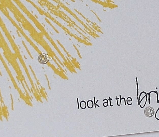
 For my card today I used Reverse Confetti set Forever Fall and the current Reverse Confetti Sketch for You to Try layout. I stamped the rectangular woodgrain image using Memento's Dandelion ink on my white cardstock piece. The same image was stamped on a strip of white cardstock using Hero Arts Splash chalk ink and layered on top. I die cut the tag using the RC "Tag Me" me die. To make it fit better on the layout I trimmed off the outer portion of the tag. The sentiment was stamped using Splash ink and then adhered to the layout. I stamped the heart using Dandelion ink, trimmed it out and adhered it to the tag. Some teal colored baker's twine was looped through the tag opening and some teal and yellow sequins were added to finish things off.


 For my card I used the recently released Sweet as Candy Sweet Images and Sweet Sentiments sets from Whimsy Stamps. The wrapped candies were stamped in Calypso Coral, Primrose Petals and Coastal Cabana then trimmed out and layered on the card front. The banner was stamped using River Rock, trimmed out and then stamped with the sentiment. The final portion of the sentiment was stamped using River Rock. Added some sequins and I was done. The card base is River Rock.