"We do not remember days, we remember moments." Cesare Pavese

Saturday, March 30, 2013

thinking of you...

Hello friends!!  It is a beautiful day here in the PacNW and a perfect day for an Easter egg hunt!   A beautiful day at the end of March isn't a frequent occurrence in this neck of the woods so I'm pretty darn happy!!   Have a little card I made this morning for the current Less is More and Dynamic Duo challenges.  It is "lucky dip" (same thing as "wild card") week at LIM and the ladies have asked us to use scallops on our cards.   The Dynamic Duo combo is deep pink (I used SU!'s Primrose Petals) and players choice of a second color (I used SU!'s Pear Pizzazz).


I recently purchased the SU! set French Foliage and decided to ink it up for this card.  Before putting the finished card together I spent a little bit of time determining what my color choice would be.  I initially tried SU!'s Always Artichoke, but wasn't extremely happy with the way it looked with Primrose Petals so chose Pear Pizzazz instead... the two colors play off each other much better.  I stamped the script element using the green and then the leaf using the deep pink.  The splotches were inked in the deep pink, stamped off on scrap paper and then layered on the other two images.  The sentiment is from the Hero Arts set Year Round Sentiments and was stamped in black.  I punched the bottom edge using an EK Success border punch. 

Thanks for stopping by...

Supplies:  Cardstock:  PTI white; SU! Pear Pizzazz; Stamps:  SU!; Inks:  SU! & Memento; Punch: EK Success

Friday, March 29, 2013

you're someone...

Hello friends!!  Here with a little card that I made for two challenges:  ColourQ and CAS Colours and Sketches.   I really like the color combo presented by ColourQ this week so I was definitely determined to get something made before my very busy Easter weekend sets in!


When I saw the sketch put forth by CAS Colours and Sketches this week I thought I would use my Hero Arts Bold Pop Flowers set, but then changed my mind and used another HA set, Antique Flowers and Butterflies.  I stamped the large butterflies using Always Artichoke and Simply Chartreuse (a little gift from my sweet friend, Greta) inks and then die cut them with the matching die.  The middle butterfly was stamped using Pool Party and die cut with its matching die.  The smaller butterflies were stamped using Wisteria Wonder and since I lost their matching die I had to trim them out by hand!  The top of the card stock piece was partially embossed with the Cuttlebug Modern Wallpaper EF and then the butterflies attached.  The sentiment is from another Hero Art set called Very Special. 

Thanks for stopping by...

Supplies:   Cardstock:  PTI Rustic White; Stamps:  Hero Arts:  Inks:  Stampin Up!, PTI and Memento; Dies:  Hero Arts/Sizzix; EF:  Cuttlebug

Thursday, March 28, 2013

He will rise....

Hello friends!! Easter is almost upon us and I have a card to share that I will be entering in the current Our Daily Bread Designs Shining the Light challenge.  This card is a version of a card that is in the Spring 2013 issue of Card Maker magazine (that card can be found on page 34 of CM).  I was so very happy when Card Maker picked the card for publication because it gave me a chance to showcase ODBD stamps in a widely read papercrafting magazine.


For the card I used two different ODBD sets:  Loving Memories and He Will Rise.  The card base and the ribbon are PTI's Spring Rain.  The calla lily image was stamped using Memento's Summer Sky and the sentiment using Memento Tuxedo Black.  After tying on the ribbon I added a beautiful little cross charm that I received from the super sweet Sabrina.  Sabrina is one of the uber talented ODBD "sticks".  

Thanks for stopping by... I hope that you have a wonderful Easter with your families and are able to spend some time reflecting on what our savior, Jesus, did for us all!

Supplies:  Cardstock:  PTI Spring Rain & white; Stamps:  Our Daily Bread Designs; Inks:  Memento; Ribbon:  PTI; Cross charm:  unknown

Tuesday, March 26, 2013

CCC #37. hope whispers...

Hello friends!!  Tuesday has arrived and that means time for a brand new CASology challenge!!  Everyone really rocked the challenge last week and came up with some really fabulous cards using the song cue word.  This week we have another great cue word for you:  hope.  All the details for the challenge can be found here.

 
For my card this week I decided to use a lovely stamp set from the Craft's Meow called Hope Blooms.  The set has all these beautiful line drawn flowers and quotes.  I stamped one of the flowers and the sentiment using Tuxedo Black ink on cream cardstock and then colored the flower using pale green and pale pink Copic markers.   Once I was done coloring the image I mounted the piece on a cream cardstock base.   A very, very simple card using one of my favorite layouts.   I did give a few moments thought to adding maybe a few pearls, but decided against it because I honestly think that adding those few pearls would have just been a distraction.  Clean and simple may seem like it is easy, but in fact it can be very hard because you really need to exercise restraint and know when to recognize that you have added too much to your card... even if it is just a few pearls.

Thanks for stopping by.... I really cannot wait to see what hope related ideas all you super talented papercrafters come up with for this challenge!! In the meantime make sure you check out the cards from the rest of the design team: Melissa, Tracey, Jen, Ardyth, Judy, Maureen, and Meghan

Supplies:  Cardstock:  PTI Vintage Cream; Stamps:  The Craft's Meow; Ink:  Memento Tuxedo Black; Copic markers


Monday, March 25, 2013

i often...

Hello friends!!  Today is March 25th and that means time for a new PTI blog hop.  I had set a goal for myself to participate in the PTI blog hops on a more frequent basis, but one thing or another came up and I just didn't have the time.  But this month I made sure that I knew in advance what the challenge would be and I got my card done... YAY!  


Over the last few months I have noticed more and more cards that used sequins on them instead of rhinestones and pearls.  I was intrigued and started to look around to see who might sell them.  The first place I checked was Ellen Hutson and much to my delight I saw that she carries them.  So far I have purchased four different colors and will probably added to my collection in the near future!  For my blog hop card I used the PTI set Half & Half and a layout from Deconstructed Sketches.  I went with a green, black and white color combo and after I was done making the card realized that maybe I should have used a different sentiment as this isn't a real sunshiny kind of card!  Anywhoo... it is what it is.   I didn't use a ton of sequin (although I did have an idea that would have used lots, lol!), but sometimes you don't need a lot of something to make an impact. 

Thanks for stopping by...

Supplies:  Cardstock:  PTI Rustic White, SU! Pear Pizzazz; PP:  PTI Bitty Dot Basics - True Black;  Stamps:  PTI Half & Half; Ink:  SU! Pear Pizzazz & Memento Tuxedo Black; Dies:  PTI Half & Half and Fillable Frames #10; Verve Pennant Border die; Sequins:  Ellen Hutson - Dill; Ribbon: PTI True Black

Sunday, March 24, 2013

bloom in adversity

Hello friends... back this evening with another card.  This one is for the current Dynamic Duos color challenge (Pretty in Pink and Regal Rose), as well as the My Favorite Things Wednesday Sketch #116.  Did lots of stamping with this one... no patterned paper in sight!

 
I used the newly released MFT/LJD Pretty Poppies stamp set, as well as the matching dies and my all time favorite MFT dies... Fishtail Flag Stax!  The flower heads were die cut and then stamped with the flowers using Regal Rose and Pretty in Pink.  I also die cut some leaves and stamped them, along with the stems in Crumb Cake (kraft) ink.  The Pretty Poppies comes with this long script stamp that I used the for piece underneath the fishtail flag and was stamped using Pretty in Pink ink. That piece was matted with some kraft cardstock to break up all the white.  Adhered the flower heads and leaves and then finished everything off with a bit of Regal Rose ribbon and the sentiment that I stamped on a MFT Mini Doily Circle die.

Thanks for stopping by...

Supplies:  Cardstock:  PTI white and kraft; Stamps and dies:  My Favorite Things; Ink:  Stampin Up!; Ribbon:  Stampin Up!

a cheery sort of day....

Hello friends!!  Here with my card for the current Less is More challenge to use beads on your project.  When I saw the challenge my heart sank... beads??? Seriously???  Now at one point in my crafting career I had tons of seed beads.  I used to do a lot of cross-stitching and started combining cross-stitch and beading.   Unfortunately, I had to give up cross-stitching for several different reasons and slowly started getting rid of all the beads I had accumulated. So... I'm pretty much bead-less.  I started hunting around to see what I might be able to come up with and thankfully spied a little packet of Valentine goodies that my sweet friend, Natalie, sent me.  Some of those goodies included beads!! YAY... I was saved!!


I sorted through the beads and found the starfish and the shell bead.  The colors were a bit bright for me so I tried to tone them down a bit by using a Ranger pearl paint dauber.   The little jar was die cut using my PTI jar die (first time EVER used!) and then stamped with the corresponding image from Friendship Jar Summer stamp set (first time EVER using the set, too!).  I stamped the shells inside the jar, applied some glue and added sand colored Flower Soft.   The twine was wrapped round the top of the jar, tied in a bow and the beads added.  Not the most original use of beads, but I'm pretty happy with it all the same.  I added the strip of burlap (or hessian... I think I like "hessian" much better, though), the sentiment and then the jar on top.

Thanks for stopping by...

Supplies:  All supplies except for the beads, Flower Soft & ink are PTI; Ink:  Memento Rich Cocoa and Desert Sand

Friday, March 22, 2013

thinking of you...

Hello friends!!  The weekend is here... YAY!   We have been having some typical PacNW weather this week:  rain, wind and sunshine... all in one day or even in one hour, lol!  I'm not complaining though.  We had a really mild winter and I will take that over all the snow that they get in the Midwest any day!!  Anywhoo... I got a chance to make a card today for a couple of challenges:  CAS Colours and Sketches and Cardabilities.  I haven't done a Cardabilities challenge in ages and really wanted to make something using the current sketch.   Since this week is color week at CAS Colours and Sketches the two challenges were a perfect fit. 
 
I hadn't intended on using two different polka dot papers for the card, but after fiddling around for a while trying to find a patterned paper in a Soft Suede-type color I had to give up because I couldn't find anything that worked.   I think that the SU! River Rock color (the sort of beige-green color) needs to be put with a bolder color like the red to make it work.  The bird (Memory Box Perched Reed Bird) was die cut from the Soft Suede color and then embossed with the Swiss Dot (along with one of the little white banners) for some added texture as well as to tie them into the whole polka dot thing I had going on.  All the banners were die cut using my favorite dies EVER... My Favorite Things Fishtail Flag Stax dies.  The sentiment if from a Hero Arts/BasicGrey set called Enjoy.

Supplies:  Cardstock:  PTI white; Patterned Paper:  Stampin Up!; Dies:  My Favorite Things & Memory Box; Stamps:  Hero Arts/BasicGrey; Ink:  Tuxedo Black; Swiss Dot EF

Wednesday, March 20, 2013

an ikat thank you....

Hello friends!!  A super windy day here in the PacNW... thought I was going to blow away when I picked up the little guy from school!!  Have a card I made using the new ColourQ combo (black, yellow, bright blue, light blue and white).  I'm not a super trendy person when it comes to clothes or stamping, but when I saw the Irresistibly Ikat set that was released by PTI last month I was intrigued by the designs and so I purchased it... so glad I did because sometimes you just have to step outside your little box and try a trend!!  

My sister needed a masculine "thank you" card, but after going through my huge assortment of cards I could not find a single "thank you" that would work for a guy.  So, I decided to whip out my Irresistibly Ikat set and make a thank you card with it using the ColourQ combo.  A pretty darn simple card, but so perfect for a guy.  It is a bit hard to tell, but I did use to different shades of blue (Memento Danube Blue and SU!'s Brocade Blue).  You can definitely see the difference IRL.  And since this uses a chevron-style image I'm going to pop it into the Moxie Fab World Chevron challenge.

Thanks for stopping by...

Supplies:  Cardstock:  PTI white; Stamps:  PTI; Ink:  Memento Danube Blue, Tuxedo Black & Dandelion; SU! Brocade Blue

Tuesday, March 19, 2013

CCC #36... Day-o, day-o!!

Hello friends... another Tuesday is here and with comes a brand new CASology challenge.   I think we can all safely say that last week's cue word was rather well... challenging!  Hopefully this week's cue word will not be quite so challenging for everyone.  So... without further ado this week's cue word is "song".  And this week we also have a fabulous sponsor The Alley Way Stamps!!  If you haven't seen their super fun and fabulous stamps then you really need to check them out like right now.  TAWS was so kind and provided the CASology design team with super fun sets to play with and I received the cute Tropic Topic set.  And when I spied the cute little monkey in the set I got the idea to base my card on the "Banana Boat Song" also known as "Day-o".  All the deets for this week's challenge can be found here.


The little monkey was stamped on kraft cardstock using black ink and trimmed out.  I thought about coloring him a bit but decided to just leave him as is for this card.  A couple of bananas were stamped on yellow cardstock and trimmed out.  The cream cardstock piece was run through my Big Shot with a piece of burlap (hessian as it is called in Europe) on top to create the texture.  I got this idea from the amazingly talented Jenny of Crafting in the Country... the girl is an absolutely brilliant papercrafter so check out her blog!!  I knotted the ends of a small piece of cording and adhered to the card and then attached the little monkey.  A piece of kraft cardstock was run through the big shot using the burlap as well, a piece trimmed out and I handwrote the sentiment on it.  It was attached along with the bananas.  I think I should have put a banana in the monkey's hand, but too late now!!

Thanks for stopping by.... I really cannot wait to see what song related ideas all you super talented papercrafters come up with for this challenge!! In the meantime make sure you check out the cards from the rest of the design team: Melissa, Tracey, Jen, Ardyth, Judy, Maureen, and Meghan

Sunday, March 17, 2013

see beyond...

Hello friends!!  Here with a card for the current Dynamic Duos color combo.  This week is "black tie" week and the colors are light yellow (So Saffron) and black. there is also a "dessert" option to use ribbon, but using ribbon didn't fit in the with sketch I used (Deconstructed Sketch 93) so I didn't add any.   The DS sketch is really clean and simple and so I wanted to keep my card fairly CAS, as well. 


I used one of my favorite Taylored Expressions stamp sets, Discover Your Wings, for the card.  The yellow patterned paper is a little bit of paper from a Stampin Up! designer paper pack called Tea for Two and the black polka dot is from PaperTrey Ink.  It is a bit hard to see, but I used my Scor-Buddy to create score lines in the white cardstock to make it look like beadboard.  The scalloped piece was made using a EK Success punch and the butterfly is a Martha Stewart punch with a black sequin added to the body.  The banner was die cut with a fishtail flag die from My Favorite Things. 

Thanks for stopping by...

Supplies:  Cardstock:  PTI white and black; Patterned Paper:  PTI and Stampin Up!; Stamps:  Taylored Expressions; Ink:  SU! So Saffron & Memento Tuxedo Black; Sequin:  Ellen Hutson; Punches:  Martha Stewart & EKSuccess

Saturday, March 16, 2013

i chair-ish.....

Well hellloooo!!  Goodness it has been a while since I last posted.  I didn't have much card making time this past week as I was too busy doing a bit of temp work for a friend.   Now that I done with that I finally got some time to participate in a few of my favorite challenges.  This little card is for the current Less is More challenge "Frame It", as well as the current CAS(E) this Sketch challenge.   I was quite happy to see that I got an honorable mention shout out from the gals at CAS(E) this Sketch for my card for challenge #18!  Thanks!!!


Anywhoo... on to this week's card!!  As indicated the LIM challenge is to use a frame of some sort on your project and when I saw the LIM challenge I knew it would work perfectly with the CAS(E) this Sketch challenge... yay!!!  For my frame I did a little bit of embossing with a Spellbinders Scalloped Square die to create the frame and then die cut a piece of white cardstock using a plain square die that fit inside the frame.   The banner was die cut using a MFT Fishtail Flag Stax die.  In order to have the fishtail on each side of the banner I simply turned the banner around in the die so that the other end could be fishtailed.   I used my long neglect PTI On My Couch set (and matching die) for the little chair and sentiment. 

Thanks for stopping by....

Supplies:  Cardstock:  PTI white; SU! Real Red; Stamps:  PTI; Ink:  SU! Real Red, Memento Tuxedo Black; Dies:  Spellbinders, My Favorite Things & PTI

Tuesday, March 12, 2013

CCC #35... sending you sunshine

Hello friends!!  Tuesday is here and with it comes a brand new CASology cue word!!  This week our cue word is literally out of this world!  Say hello to "extraterrestrial"!!  How about that for a cue word, huh?   Had me scratchin' my head about what I was doing to make because I was really, really stumped, lol!!   So I looked up the word in the dictionary and found that the definition states that it is anything that originated or existed outside the earth or its atmosphere, which includes the sun, the moon, the stars, asteriods, etc (have I given you some ideas??)   So, instead of little green men (actually "greys" as people steeped in Ufology... yes, that is a word I looked it up, too... would call them) I went with the sun. 


The lovely layout for my card is courtesy of the ready to expire CAS(E) this Sketch layout (at the time this goes live I will have but a few hours left to get it posted).  Anywhoo... I used a lovely set from Taylored Expressions called Garden Party Blooms as it has a sun with a matching die (love those matching dies, don't you???) and the sweet sentiment I used.  The clouds were die cut using a cloud die from PTI.   The little strip of paper is from the My Mind's Eye Moments 6x6 pad and the card base was made using PTI's Blueberry Sky cs... most appropriate I thought. 

Thanks for stopping by.... I really cannot wait to see what "out of this world" ideas all you super talented papercrafters come up with for this challenge!!  In the meantime make sure you check out the cards from the rest of the design team:   Melissa, Tracey, Jen, Ardyth, Judy, Maureen, Meghan and this week's guest designer, Beate.

Sunday, March 10, 2013

hope... and washi tape

hello friends!  here with a card i made for one of the moxie fab world challenges... the one to use washi tape.   going to be honest and state that i'm pretty washi tape challenged.  i tear pieces off stick'em on my cardstock and then take'em off because i just don't like how it looks.  so it is kinda funny that i made something for this particular challenge... but on saturday morning as i was contemplating what to make for a completely different challenge and once, again, trying to use washi tape an idea popped into my head.   why not make a flower using the tapes... and so i did.


putting together the flower took some time and patience because creating this flower required me to tear off multiple strips of tape and then adhere them together, sticky side to sticky side.   for someone who likes things to be neatly put together adhering strips of washi tape together required me to let go of neat and embrace not so neat, lol!!  once i got all the strips adhered together i formed them into loops and then arranged them in to the flower shape.  since some of the ends were not neatly matched and sticky this was helpful in keeping the flower together while i carefully pierced a hole through the center and inserted a tiny brad.  after that was done i finished off the flower by adhering a red button to the center.  i then repeated the process and created three "leaves".  i stamped the sentiment from the craft's meow set hope blooms and then arranged the flower next to the sentiment.  

thanks for stopping by....

supplies:  cardstock:  pti rustic white; stamps:  the craft's meow; ink:  memento tuxedo black; washi tapes:  impress rubber stamps; button:  pti pure poppy

Saturday, March 9, 2013

Dots and Stripes...

Hello!!   Enjoying a beautiful sunny day here in Western Washington... still a bit cold, but I will take it just the same!!  Hope all is well in your part of the world!!  Have two cards that I made for the new Less is More challenge, as well as the new Dynamic Duos challenge.   When I first saw the LIM challenge I thought "oh... make something with spots or stripes", but then I re-read the post and saw it was use both spots and stripes and it has to be one layer!!  Yikes!!! That threw a wrinkle into things for me.  Had to do some out of the box thinking for this one, but I came up with two cards that I really like!


The first card came about as I was playing with several PTI sets (Polka Dot Basics 2, Distressed Stripes and Bitty Background Blocks) to see what I could come up with.   Several attempts using Polka Dot Basics and Distressed Stripes came to nothing.  But then I decided to stamp the little background block that has tiny dots in it and add the two stripes... loved it!!   I think this card will also work for this week's CAS-ual Fridays challenge (color blocking) so I'm going to pop it into that challenge as well.   The sentiment is from another PTI set Signature Greetings.  The Dynamic Duo colors this week are Pool Party and Lucky Limeade.  I don't have Lucky Limeade so I used Pear Pizzazz instead.


The second card happened because I took a look through my PTI mini sets and saw the Bits & Buttons set.  The buttons are... well... dots and some of them have stripes and dots in the buttons!!  For this card I created a border using two different sized dots and the two Dynamic Duo colors.  The sentiment is also from Signature Greetings.   I haven't used this many PTI sets ever!  Of the two card, the first one is my favorite.

Thanks for stopping by....

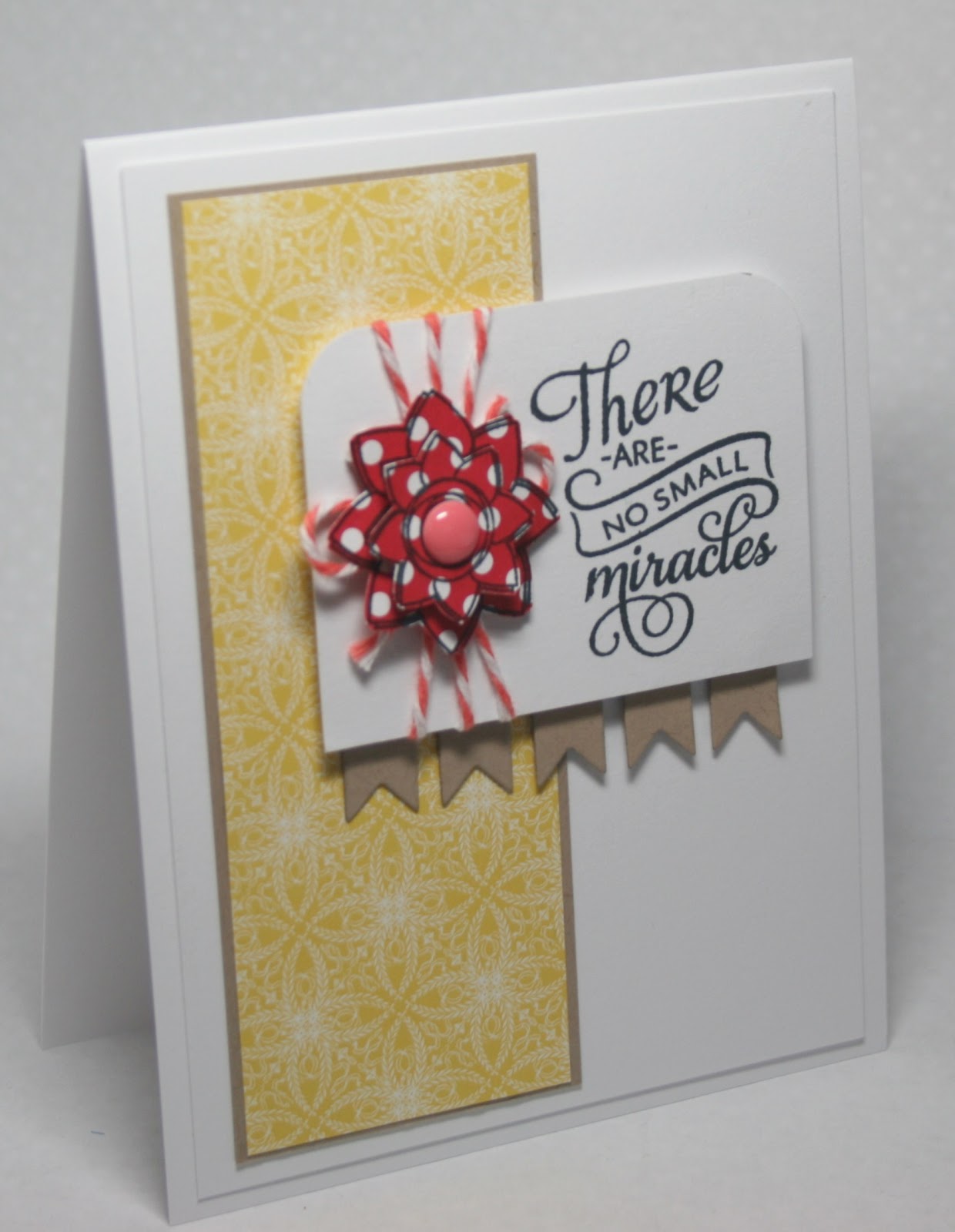
Supplies:  Cardstock:  PTI white; Stamps:  PTI; Inks:  Stampin Up!, Memento Tuxedo Black Sequins:  Ellen Hutson

Friday, March 8, 2013

miracles....

Hello!!  Hey... wow... the weekend is here!!  Where did the time go??  Have a little card I made using this week's ColourQ combo and a Viva la Verve sketch.   Back when I first started stamping Verve was one of the first companies I bought stamps from, but as can happen with this little hobby (addiction???) of ours I was buying from too many companies and needed to cut back.  Verve was one of the companies I cut back on.  Now I have come full circle and I'm back buying Verve... after cutting out several other companies, ha! 


Anywhoo... this was a tough color combo for me and while I like my card I'm not super happy with how it turned out.   And it took way too long to complete!!  I think that happened because there were too many "fiddly" things to get worked out!  This is actually my second attempt at making something using these colors, but that one didn't even make it to the "completed card" stage!! And to think that when I first saw the combo I thought "this will be an easy one to put together"... boy was I wrong, lol!! I used the Verve set "Wonderfully Made" and some different patterned papers from Stampin Up!  That cute little banner was cut using the Verve banner border die.   The bakers twine is from My Mind's Eye, as is the enamel dot in the center of the flower. 

Thanks for stopping by....

Supplies:  Cardstock:  PTI white; SU! kraft; Stamps:  Verve; Die:  Verve; Ink:  Memento Tuxedo Black; Bakers Twine & enamel dot:  My Mind's Eye; Patterned Paper:  Stampin Up!

Tuesday, March 5, 2013

CCC #34... Easter Blessings

Hello friends!!  Tuesday is here and that means time for a brand new challenge.  With Easter at the end of the month the cue word this week is "bunny".   I can't wait to see all the fabulous clean and simple bunny cards I know are going to hop into the gallery!!  Our guest designer this week is the very talented Jenny!!  And to make things even more fun (if that is possible) we have a fabulous sponsor this week... Cindy Coutts who is offering up two prizes!!!    All the deets can be found here.


So... when I saw the word "bunny" I pretty much thought of only one thing:  to make a card with a bunny on it.  And that is exactly what I did!   My tip this week??  Don't ever be afraid to do the obvious!   I used a simple and classis sort of layout and used only two colors.  To give more interest to the card I decided to make the card a size other than 4 1/4 and 5 1/2... my card is 3 3/4 by 5 1/2.   The images are from the PTI set Tags of Spring.  I stamped the images, then punched them out using a 1 3/4 inch punch and layered them as you see.  The sentiment was stamped and a few white pearls finished it off.

Thanks for stopping by.... make sure you check out the cards from the rest of the design team: Melissa, Tracey, Jen, Ardyth, Judy, Maureen, Meghan and this week's guest designer, Jenny. Can't wait to see what you come up with using this week's cue word!

Sunday, March 3, 2013

much happiness...

Hello there!!  Finally getting a chance to post my card for this week's Less is More challenge... a lovely color challenge this week.  But I must admit that this color challenge was really quite challenging for me.   For this challenge the colors are kinda open to interpretation and that is where my problem lay... trying to figure out what colors I could use.  Now it is obvious that one of the colors is pink, but beyond that I was really taking a stab in the dark.   I spent a great deal of time looking through the cards already posted, as well as Chrissie and Jen's card and finally settled on this:


Taking a cue from the super talented Vicky, I used some papers from the SU! Tea for Two designer papers, as well as Crumb Cake and white.  The stamp is from the Verve set Brighter Days and was stamped using Crumb Cake ink.   The layout for the card comes from the current Deconstructed Sketch... a great sketch to use for a clean and simple card.  The banners were die cut using my MFT Fishtail Flag Layers Stax.  Added a few pink gems to finish things off. 

Thanks for stopping by... and thank you to everyone who voted for me in the Practical Scrapper card contest.  Unfortunately I did not make it to the Top 5.  But I had a really fun time while it lasted!!

Supplies:  Card stock:  PTI white; SU! Crumb Cake; Stamps:  Verve; Ink:  SU! Crumb Cake; DP:  SU! Tea for Two; Rhinestones:  American Crafts; Dies:  MFT Fishtail Flag Layers Stax