
Supplies: Cardstock: PTI White & Raspberry Fizz; PP: Cosmo Cricket DeLovely; Embellishments: DeLovely chip sticker; white silk ribbon; EK Success bracket punch; Cuttlebug; Spellbinders Labels 3 dies

 A super quick card I made for the current DeNami Design theme challenge, summer. I used DeNami's cute little set of tropical drinks for the card, as well as some Stampin Up! designer paper. The card layout is based on the current clean&simple sketch, FTL 96. I simply cut the dp to fit the card front, matted it with cardstock and adhered to the card front. I stamped one of hte cute little drinks on white cardstock with Tuxedo Black ink, colored it with several different Prisma pencils and the blender pencil and it was trimmed out. The sentiment from Close to my Heart was stamped in Tuxedo Black and the little drink attached to the card front.
 Finally got a card done for the current ColourQ challenge. I was feeling pretty mojo-less this week and just couldn't seem to come up with any good ideas for the lovely color combo Arielle debut on Tuesday. On Monday a box of goodies had arrived from Creative Play Stamps (lightening fast delivery, too, as I had only placed my order on Friday evening, I think! Check them out as you can sign up to get monthly coupons and they always have new stuff discounted.) and with it came this cute stamp Little Butterfly from Hero Arts. I had already used it once this week on another card, but last night it hit me: it was perfect for an idea I had for ColourQ.


 Another quick post, this time a card for the current Waltzingmouse Stamps Sketch challenge (WMSC3). Today is the first time I have managed to get my card done the day before the challenge closes! Maybe next week I can get it done two days before!!! Anywhoo.... another lovely sketch was provided for our enjoyment. I had thought I might combine the sketch with a color challenge, but ended up taking a few steps out of my box (ie comfort zone) and came up with my own color combo. When I was all finished, I was really quite happy with what I had chosen. I used some yummy Cosmo Cricket Material Girl papers as my jumping off point, threw in some colors from SU! and PTI and mixed them all up! A bit o' distressing was done on this card and I had to laugh when I realized just how much it looked like the card I had made the JUGs challenge (see this post here)! I used a stamp from WMS Very Vintage Labels 4 set and stamps from the Taylored Expressions set CreativiTea (the teapot and sentiment).
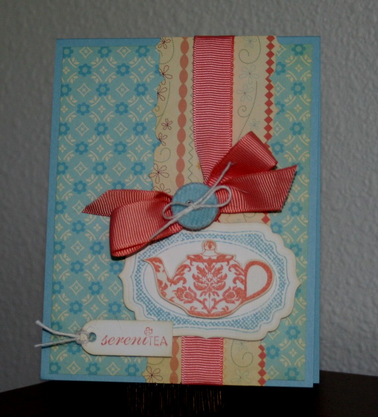
 A quick post about my card for the current JUGs challenge. The challenge this week is a color challenge: pink, brown and vanilla. I have been feeling mojo-less for the last few days and to get things restarted I decided to combine the JUGs challenge with the current PaperCrafts Connection sketch challenge #4. Unfortunately I don't have a picture of the sketch. As I thought about what I paper I would use for the card I thought about some old SU! DP that I have that was perfect for the challenge. I don't even remember the name, just that it was pink, brown and vanilla. I used Nesties Labels 9 dies and a cute new stamp from Hero Arts called Little Butterfly. The sentiment is from the Taylored Expressions set CreativTea. Did some sponging/distressing on the edges of the die cut piece, as well as on the patterned paper. The butterfly was stamped in Close to Cocoa on the die cut piece and then in Pretty in Pink on a scrap of cream cardstock. Just the wings were cut out and popped up on top of the brown image.
 Its a rainy afternoon here in the Pacific Northwest, leaving most of us wondering if summer will ever come! A perfect day though to stay inside and make some cards. So far I have gotten one done.... a card for the current Play Date Cafe' challenge (PDCC34), to use black and white with blue. I just love the photo they provided for inspiration! For my card I decided to use a sketch from Clean & Simple and a couple of stamps from Hero Arts, Hydrangea & French Writing with Butterfly.
 Since October of last year I have been getting stamps from The {Stamps}of Life through their monthly club. The stamps are clear stamps and all the sets are super cute. The brains and creativity behind The {Stamps} of Life is Stephanie Barnard who is an absolute sweetie pie! The set for June called Kites2Fly is super duper cute and I couldn't wait to make something with it! When I saw the current sketch from Clean & Simple, FTL95 I knew immediately that I was going to use Kites2Fly for the sketch. I stamped the kite on white cardstock and then again on patterned paper from October Afternoon's Thrift Shop 8x8 pad and did some paper piecing. I hand drew the kite string, pierced the cardstock and then hand stitched the kite string with DMC floss. I finished off the kite string by sewing on 3 tiny buttons. I assembled the card and then used some more of the DMC floss to tie around the card. I love how it turned out!

 Finally got a chance to make a card for the current Taylored Expressions, TESC117, sketch challenge. I used the colors from the current Color Throwdown, CTD97. The Color Throwdown colors this week are Night of Navy, Certain Celery and Cameo Coral. I paired them with PTI's Vintage Cream as my neutral.

 This shouldn't have been as hard as it turned out to be, but I guess that is because I committed myself to a path and wasn't going to move from it. It all started with my choice to use several shades of Bazzill green cardstock for the card. You see, the current ODBD challenge ODBDSLC17 is a monochromatic color challenge to use either yellow, green or blue or you could use all three. I should have gone with that option! Anyway, I also wanted to use my new Fern & Fiddles stamp set from Flourishes that I won last week for the card so green it was. The 2nd challenge element is provided by FTTC71: to use embossing on your card. And for the last challenge, Waltzingmouse Stamp sketch challenge #2, WMSC2, to use this lovely sketch:
  Can I just tell you how happy I am I found the ColourQ challenge? Really happy! Arielle, the creative gal behind this blog, really knows how to find some fantastic inspiration for each of her color challenges. This week is no exception. Take a look at these yummy colors:


 This week is the first week for the new Waltzingmouse Sketch challenge blog! I had longed for some of the wonderful stamps from Waltzingmouse and finally about a month ago I was able to get my hands on them. Can you say LOVELY??? Because that is what they are, lovely. I paired this week's ColourQ challenge (cqc36) with Waltzingmouse's first sketch (WMSC1) challenge. Isn't that little knitted toy just the cutest thing?? It reminds me of my boys "Ugly Dolls"! And what fun colors! Now, Claire Brennan, the owner of Waltzingmouse Stamps is well a creative genius! She designed a whole line of stamps that work perfectly with a lot of those Spellbinders Nestabilities we all own. And, it gets better! Her image sets are just out of this world!
 For my card I used the WMS set Asian Gardens. A beautiful set and I can truly say I have not seen another set like it out on the market. Can't wait to use it again, and again, and again! I stamped the tree top portion on white cardstock with VersaMagic Aspen Mist ink which is very, very close to SU!'s Sage Shadow and then trimmed all parts out. I did all my diecutting any layering and then stamped the trunk in the center with Choc. Chip ink and layered on the tree top parts. Added some rhinestones and a few more bits and I was done.
 A card today for ODBD's current challenge to use the sketch they provided. Several weeks ago I was fortunate enough to have Random.org pluck my name from the entrants for ODBDSLC14 and I won a ODBD gift certificate! I'm using one of the sets that I purchased using that gift certificate: Grow in Grace. I have had my eye on that set (and alot more) for a loooong time and was so excited to finally get it! I used more papers from the DCWV mat stack The Linen Closet and some completely YUMMY satin ribbon from the Stamp Simply Ribbon Store. I stamped the sentiment on some PTI white shimmer cardstock that I die cut with a Spellbinders large scallop circle die in SU!'s Baja Breeze ink. I then stamped the dogwood image next to it using Memento's London Fog. The image was stamped again on PTI's white cardstock, colored with my Prisma pencils and gamsol, trimmed out and then adhered over the first image using SU! dimensionals.


